In today’s digital age, users access websites and applications through a multitude of devices with varying screen sizes. Ensuring a seamless experience across these devices is crucial for user satisfaction and engagement. This article delves into the principles of responsive design, its importance, and essential tips for creating a responsive UI/UX.
What is Responsive Design?
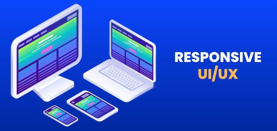
Responsive design is a web development approach that ensures a website or application adapts smoothly to different screen sizes and devices. It involves creating flexible layouts, images, and media queries that adjust to the user’s screen, providing an optimal viewing experience.
A responsive design automatically adjusts the layout based on the screen size, orientation, and resolution, ensuring that content is easily accessible and aesthetically pleasing on all devices, from smartphones and tablets to laptops and desktop computers.

Importance of Responsive UI:
| Aspect | Description |
| User Experience | Responsive UI ensures users have a consistent and enjoyable experience, regardless of device. |
| SEO Benefits | Google favors mobile-friendly sites, improving search rankings for responsive designs. |
| Increased Reach | By accommodating various devices, responsive design widens the potential audience. |
| Cost-Effective | Instead of developing separate sites for different devices, a single responsive design is maintained. |
| Future-Proofing | Prospective-Looking Future gadgets and screen sizes can be accommodated by responsive design. |
| Improved Conversion Rates | A seamless user experience across devices enhances user satisfaction and boosts conversions. |
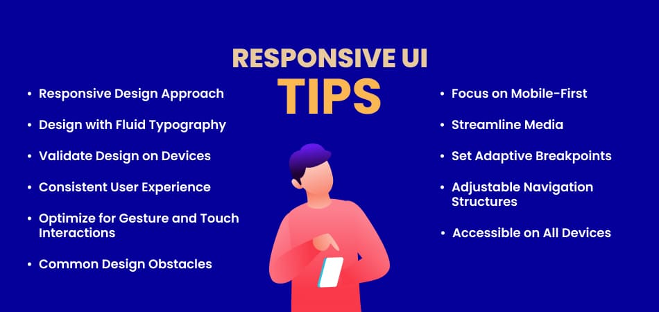
Essential Tips for Designing a Responsive UI:

Adopt a Responsive Design Approach
To start, embrace a responsive design philosophy by planning your design to adapt to different screen sizes from the outset. Use flexible grids and layouts that adjust based on the user’s screen. Avoid fixed-width layouts, as they do not scale well across devices.
Key practices include:
- Using fluid grids that use percentages instead of fixed measurements.
- Designing flexible images that scale within their containing elements.
- Implementing CSS media queries to apply different styles based on screen characteristics.
Focus on Mobile-First Design Principles
Mobile-first design prioritizes the mobile user experience before expanding to larger screens. This approach ensures that the essential features and content are optimized for the smallest screens, providing a strong foundation for enhancing the design for larger devices.
Key practices include:
- Starting the design process with mobile layouts.
- Ensuring fast load times and minimal resource use on mobile.
- Enhancing the mobile design for larger screens using progressive enhancement.
Design with Fluid Typography
Fluid typography adapts text size based on the viewport size, ensuring readability across all devices. This involves using relative units like percentages, ems, or rems instead of fixed sizes.
Key practices include:
- Using CSS techniques such as viewport width (vw) units for scalable text.
- Implementing media queries to adjust font sizes at different breakpoints.
- Ensuring that reading is comfortable across all platforms.
Streamline Media for Faster Load Times
Optimizing images and media for responsiveness not only improves load times but also enhances user experience. Use responsive image techniques and modern formats like WebP.
Key practices include:
- Using the srcset attribute to serve appropriate images based on screen size and resolution.
- Compressing images without sacrificing quality.
- Lazy loading images to improve initial page load performance.
Validate Design on Various Devices
Testing your design on multiple devices and screen sizes is crucial to ensure consistency and functionality. Use tools and emulators to simulate different environments and gather feedback.
Key practices include:
- Utilizing browser developer tools to test responsiveness.
- Accessing real devices for thorough testing.
- Gathering user feedback from a diverse group of users.
Set Adaptive Design Breakpoints
Breakpoints are specific points where the layout adjusts to provide the best possible user experience. Establishing effective breakpoints ensures that the design adapts seamlessly across various screen sizes.
Key practices include:
- Identifying common screen sizes and setting breakpoints accordingly.
- Using media queries to apply different styles at each breakpoint.
- Testing the design at each breakpoint to ensure a smooth transition.
Maintain a Consistent User Experience
A consistent user experience across all devices builds trust and familiarity. Ensure that your design elements, such as navigation and buttons, are uniform and recognizable.
Key practices include:
- Keeping key interface elements consistent.
- Using a style guide to maintain uniformity.
- Ensuring that interactive elements behave consistently across devices.
Implement Adjustable Navigation Structures
Navigation is a critical component of responsive design. Ensure that your navigation is flexible and intuitive, regardless of the screen size.
Key practices include:
- Using collapsible menus on smaller screens.
- Ensuring navigation items are easily accessible and tappable.
- Providing clear navigation paths for all devices.
Optimize for Gesture and Touch Interactions
Touch interactions and gestures are integral to the mobile experience. Design your UI to accommodate these interactions effectively.
Key practices include:
- Ensuring that touch targets are suitably spaced and of sufficient size.
- Supporting common gestures like swipe and pinch.
- Providing visual feedback for touch interactions.
Make Designs Accessible on All Devices
Making your design accessible guarantees that everyone, including those with disabilities, can use it. Implementing accessibility best practices makes your design inclusive.
Key practices include:
- Using semantic HTML for better screen reader support.
- Ensuring sufficient color contrast for readability.
- Allowing individuals unable to use a mouse to navigate using the keyboard.
Overcome Common Design Obstacles
Responsive design comes with its own set of challenges. Addressing these obstacles is key to creating a successful responsive UI.
Key practices include:
- Managing varying screen sizes and resolutions.
- Ensuring consistent performance across devices.
- Dealing with different input methods (touch, mouse, keyboard).
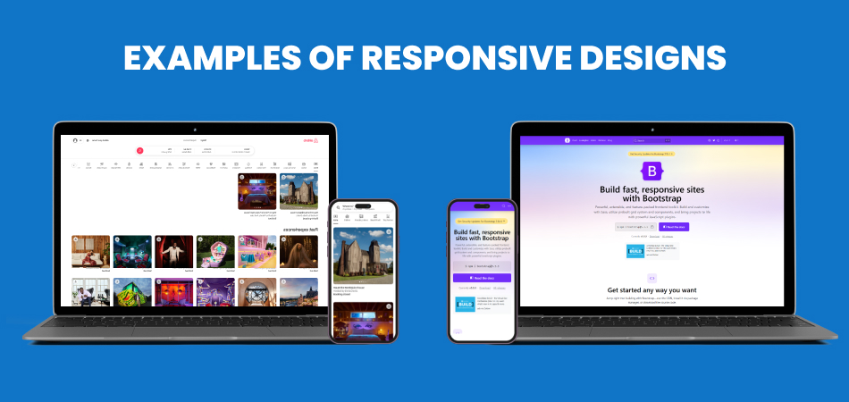
Some Examples of Responsive Designs:

1. Airbnb
Design Features:
- – Fluid Grid Layout: Airbnb uses a fluid grid system that adjusts the layout of listings and images according to the screen size. By doing this, consumers are guaranteed a consistent surfing experience regardless of the device they are using—a desktop, tablet, or smartphone.
- – Flexible Images: Images of properties are set to be responsive, maintaining their aspect ratio and fitting within their container regardless of the screen size.
- – Adaptive Navigation: The navigation menu changes from a horizontal bar on larger screens to a hamburger menu on smaller screens, optimizing space and usability on mobile devices.
Impact on User Experience:
- – Provides a seamless browsing experience across devices.
- – Ensures property images are clear and appropriately sized.
- – Makes navigation intuitive and accessible on smaller screens.
2. Bootstrap Documentation
Design Features:
- – Responsive Grid System: Bootstrap’s documentation demonstrates its own grid system, which is based on a 12-column layout that adjusts according to the screen size. This showcases how developers can create flexible layouts.
- – Code Snippets: The documentation provides responsive examples with code snippets that adapt to different screen sizes, helping developers understand how to implement responsive design in their projects.
- – Mobile-Friendly Navigation: The documentation’s sidebar collapses into a dropdown menu on smaller screens, ensuring that users can easily navigate through sections without cluttering the screen.
Impact on User Experience:
- – Offers clear and practical examples of responsive design.
- – Ensures the documentation is readable and easy to navigate on all devices.
- – Helps developers create responsive websites using Bootstrap.
3. Slack
Design Features:
- – Adaptive Interface: Slack’s interface adapts to different screen sizes by reordering elements. For instance, the sidebar with channels and direct messages collapses into a hamburger menu on smaller screens, while it remains visible on larger screens.
- – Flexible Content Areas: The main content area, where messages are displayed, adjusts its width according to the screen size, ensuring that messages are readable without requiring horizontal scrolling.
- – Responsive Media: Images, files, and other media shared within Slack conversations resize automatically to fit within the viewport, maintaining usability and aesthetics.
Impact on User Experience:
- – Ensures that team communication remains efficient across devices.
- – Maintains a clean and organized interface on both desktop and mobile.
- – Regardless of the device being used, offers a consistent user experience.
4. Etsy
Design Features:
- – Dynamic Grid Layout: Etsy uses a dynamic grid layout that rearranges product listings based on the screen size. On larger screens, multiple columns of products are displayed, while on smaller screens, the layout switches to a single column.
- – Responsive Product Images: Product images on Etsy are responsive, scaling appropriately to fit different screen sizes without losing quality or aspect ratio.
- – Optimized Search and Filter: The search bar and filter options adjust for different screen sizes, ensuring that users can easily find products whether they are using a desktop or mobile device.
Impact on User Experience:
- – Enhances the shopping experience by making it easy to browse products on any device.
- – Ensures product images are displayed clearly and attractively.
- – Maintains functionality and accessibility of search and filter options.
5. The Guardian
Design Features:
- – Flexible Grid System: The Guardian uses a flexible grid system that adjusts the layout of articles, images, and ads based on the screen size. This ensures that content is presented in an organized manner on all devices.
- – Responsive Typography: Text size and line height are adjusted based on the viewport size to ensure readability on both small and large screens.
- – Adaptive Navigation: The navigation menu adapts to different screen sizes by collapsing into a dropdown menu on mobile devices, making it easy for users to access different sections of the website.
Impact on User Experience:
- – Provides a readable and organized presentation of news content.
- – Ensures that articles are accessible and easy to read on any device.
- – Maintains usability and accessibility of navigation options.
Conclusion
Designing for different screen sizes is essential in today’s multi-device world. By adopting responsive design principles and focusing on key aspects like mobile-first design, fluid typography, media optimization, and accessibility, you can create a seamless user experience across all devices. Remember to test your design thoroughly and address common challenges to ensure your UI/UX is responsive, engaging, and accessible to all users. Embrace these tips, and you’ll be well on your way to designing a responsive UI/UX that stands out in the digital landscape.


