React, a Javascript library, has become increasingly popular in the dynamic world of web development. Its remarkable flexibility, scalability, and high-performance capabilities make it a go-to choice for creating visually stunning user interfaces for mobile apps, websites, and hybrid applications.
When it comes to developing applications or websites, React offers a plethora of highly useful and efficient component libraries. These libraries serve as valuable resources for developers, allowing them to leverage pre-built UI components and enhance both development speed and overall code quality. Selecting the most suitable framework can have a significant impact on the efficiency, scalability, and maintainability of your project.
In this engaging blog post, we will dive into the world of component libraries in React. We will explore a curated selection of the most beneficial libraries that align perfectly with your unique project requirements. By the end, you will have a comprehensive understanding of the options available to you and be empowered to make informed decisions to optimize your development process.
List of top ReactJs Component Libraries:
But before we explore different component libraries, first let’s understand what are ReactJs Component Libraries.
What are ReactJs Component Libraries?
ReactJs component libraries are made to supercharge your React-based applications and websites. These ready-to-use tools and software systems not only offer a multitude of benefits to developers and enterprises but also act as catalysts in driving software development to new heights.
Imagine having a vast array of pre-built components at your fingertips, ready to be seamlessly integrated into your projects. From tables and charts to buttons and maps, these component libraries have got you covered. What’s more, they often come with customization options, allowing you to tailor them to perfectly match your application’s design and style.
With these versatile component libraries, developers gain access to a treasure trove of reusable and customizable elements. Whether you need buttons that dazzle, forms that flow effortlessly, navigation menus that captivate, or modals that engage, these libraries have it all. And not only do they deliver stunning designs, but they also adhere to the best practices of accessibility and user experience, ensuring that your interfaces are top-notch in every way.
Say goodbye to tedious manual UI development and say hello to the fast-track expressway of React UI component libraries. Get ready to elevate your projects with visually stunning, highly functional, and user-friendly interfaces that will leave a lasting impression on your users. The possibilities are limitless, so buckle up and get ready to embark on this thrilling journey of React UI components!
So let’s dive in and explore these life saver React UI component libraries.
Top ReactJs Component Libraries
Material UI
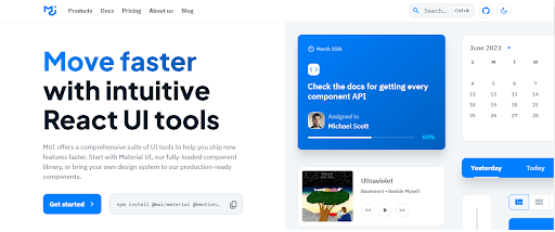
Get ready to unleash the power of Material UI, the ultimate toolkit for rapid and mesmerizing web development! With its extensive collection of customizable components, Material UI has become a household name in the ReactJs community, revolutionizing the way we build web applications. And the best part? It’s not just about aesthetics—it’s also a cost-effective solution that can save you both time and money.
Material UI is not your average component library. It’s a powerhouse that brings Google’s Material Design guidelines to life, ensuring your UI is not only modern but also visually captivating. Say goodbye to dull and outdated interfaces, and say hello to a sleek and stylish user experience that will leave your users in awe.
But here’s the exciting part: You don’t need to hire a team of app developers to incorporate these captivating components into your applications. Material UI provides an array of intriguing, ready-to-use components that you can seamlessly integrate into any project. With just a few lines of code, you can elevate your application to a whole new level.
But wait, there’s more! Material UI goes beyond just components. It equips you with a range of tools and APIs that enhance the app creation process. These resources empower you to improve the efficiency and functionality of your application, enabling you to deliver exceptional user experiences without breaking a sweat.
React Bootstrap

The duo of React & Bootstrap has revolutionized the way we build interfaces using HTML, JavaScript, and CSS libraries. Say goodbye to lengthy setups and hello to lightning-fast React and Bootstrap interfaces that will leave you in awe.
React-Bootstrap takes the Bootstrap experience to a whole new level. It offers a comprehensive collection of UI creation elements tailored for both web and mobile applications. It’s not just another JS library—it’s a complete overhaul of React itself, breathing new life into your development process.
But here’s the game-changer: React-Bootstrap provides all the power of Bootstrap’s components without the need for bootstrap.js or jQuery dependencies. It seamlessly integrates with existing React-Bootstrap themes, ensuring complete compatibility. And the best part? You have total control over each component in React-Bootstrap’s extensive repertoire. Customize, tweak, and fine-tune to your heart’s content.
With regular updates and enhancements, React-Bootstrap ensures you always have the most stable and cutting-edge solution for your development needs. By incorporating Bootstrap features into the virtual DOM, it creates a seamless and efficient workflow, making your development journey smoother than ever before.
But that’s not all. React-Bootstrap has another trick up its sleeve. Instead of importing the entire library, you can cherry-pick individual components like React-Bootstrap/button, giving you unparalleled flexibility and minimizing the amount of code sent to the client. It’s all about efficiency and delivering top-notch user experiences without unnecessary bulk.
Blueprint UI
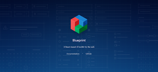
Blueprint is an open-source React UI package created by Palantir. What sets Blueprint apart from other React frameworks is its unique focus on constructing intricate and data-rich interfaces for desktop applications. With its roots in Palantir, a renowned technology company, Blueprint brings unparalleled sophistication to the table.
Blueprint goes beyond the typical component libraries. It intelligently categorizes its components based on specific use cases and essential dependencies, in addition to its comprehensive core component package. From Core components to Datetime, Select, Table, Timezone, and Icon components, Blueprint has you covered with a wide range of tools to suit your every need.
But that’s not all—Blueprint offers even more flexibility and customization options. With light and dark mode themes and adjustable design elements such as classes, color schemes, and typography, you have full control over the look and feel of your interfaces. Let your creativity shine as you craft stunning and visually captivating applications.
Think of Blueprint as your go-to toolkit for UI development. It seamlessly bridges the gap between the world of desktop and web-based applications, providing you with the perfect platform to build data-heavy and dynamic interfaces.
Onsen UI
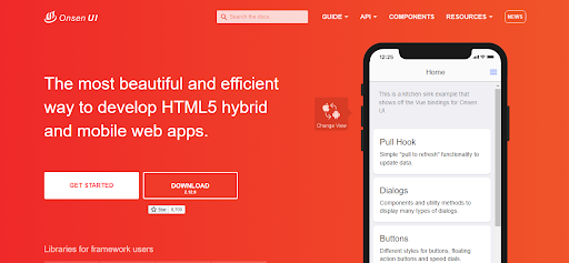
Onsen UI is a versatile framework that seamlessly integrates with Angular, Vue.js, and React. With Onsen UI, you can bid farewell to compatibility issues and embrace a cross-platform solution where the same source code effortlessly supports both iOS and Android, thanks to auto-styled components tailored for each platform.
What sets Onsen UI apart is its unique CSS-based approach to component styling. Gone are the days of relying on JavaScript functionality—Onsen UI empowers you to create stunning interfaces using the power of CSS alone. This simplifies your ReactJS development process and ensures smooth performance across different platforms.
Onsen UI is highly compatible with popular React frameworks, making it a favorite among developers. Its intuitive and interactive tutorial provides you with the guidance you need to kickstart your journey with ease. Say goodbye to the frustrations of the device and operating system-based compatibility issues, as Onsen UI caters to the ever-evolving landscape of cross-browser mobile development.
As an app developer, you know the pain of dealing with compatibility challenges. That’s why Onsen UI emerges as your ultimate solution. Leveraging the best of JavaScript and HTML5, it serves as the go-to component library for React, seamlessly integrating with Angular and Vue.js as well. Rest assured, each component will automatically adapt its styling based on the target platform, giving you a hassle-free development experience.
Ant Design
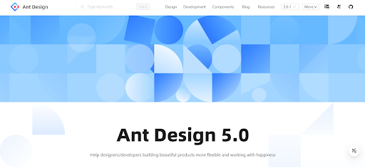
Ant Design is a comprehensive UI library that draws inspiration from the renowned design language of the Ant Financial ecosystem. This remarkable toolkit offers a vast collection of components and utilities designed to empower you in building professional-grade applications that stand out from the crowd.
Ant Design has earned its place among the top React component libraries, positioning itself as a design system tailored for enterprise-level products. With its complete and flexible design, backed by a rich library of 50 components, Ant Design equips you with all the necessary tools to envision and develop full-sized applications that meet the highest standards.
Among the standout features of Ant Design are its essential and widely-used components. From date pickers and dropdowns to icons and buttons, these meticulously crafted elements ensure your applications exude both functionality and elegance. Notably, Ant Design boasts an impressive user base of 115 companies, including esteemed names such as Kaidee, QRPoint, and Evooq.
But that’s not all—Ant Design goes above and beyond with Ant Design Pro. This comprehensive package includes pre-built templates, components, and a design kit to streamline your development process. Whether you need data visualization, mobile solutions, or graphic-centric functionalities, AntD packages, and Ant Design Pro have got you covered. Start your development journey with a tailored package that aligns with your enterprise’s specific use case.
React Router
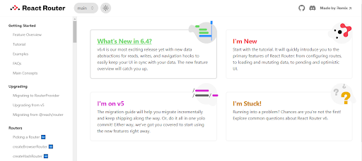
React Router is an impressive UI component library crafted by the talented Remix team and its dedicated contributors. Renowned for its declarative programming model, React Router has captured the hearts of developers worldwide. Now, with its latest version, v6, React Router combines the best features from its predecessors while introducing a range of enhancements.
When building applications with React, having a collection of reusable components and elements that can be composed declaratively is a game-changer. This is where React Router shines. By seamlessly handling URL changes and layouts, React Router empowers you to create applications with fewer routes, saving you valuable time and effort in the process.
The impact of React Router is evident in the projects of esteemed companies like Airbnb, Discord, Microsoft, and Twitter. These industry-leading teams have embraced React Router to enhance their applications, showcasing its versatility and compatibility across different interfaces.
Conclusion
React has established itself as a powerhouse in the world of web development, offering developers unparalleled flexibility, scalability, and performance. With a wide array of component libraries available, developers can leverage pre-built UI elements to enhance their projects’ speed, code quality, and overall user experience.
It’s time to embrace the power of React component libraries and embark on a thrilling journey of UI development. Say goodbye to manual UI creation and let these libraries accelerate your projects to new heights. With limitless possibilities at your fingertips, you have the tools to create remarkable applications that leave a lasting impression on users.

